

In today’s digital landscape, the importance of mobile responsive websites cannot be overstated. With the increasing use of mobile devices for online activities, it has become imperative for businesses to optimize their websites for a seamless mobile experience. Not only does a mobile responsive website enhance user experience, but it also plays a crucial role in improving mobile SEO and driving increased conversions. To achieve these goals, it is essential to follow best practices for mobile responsive websites, understand the impact on SEO, implement user engagement strategies, and measure user experience effectively. Additionally, addressing challenges and implementing solutions in developing mobile responsive websites is key to ensuring a smooth and efficient mobile browsing experience for users. With the right approach and strategies in place, businesses can leverage the power of mobile responsive websites to enhance their online presence and drive success in the digital realm.
Importance of Mobile Responsive Websites
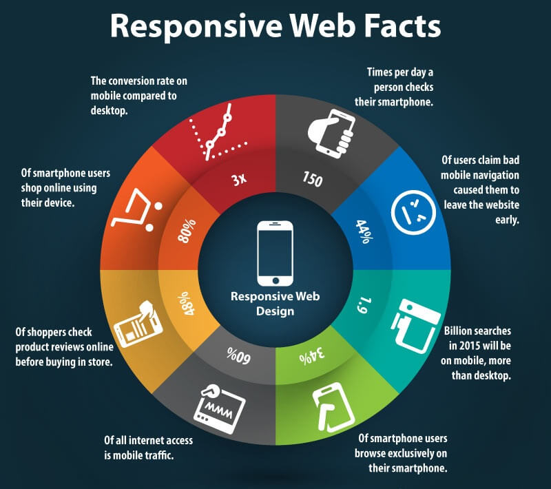
Credits: aalpha.net
Mobile responsive websites are essential for providing an enhanced user experience. With the increasing use of smartphones and tablets, it’s crucial to ensure that your website is easily accessible and navigable on these devices. A mobile responsive website allows users to seamlessly interact with your content, leading to higher engagement and satisfaction.
In addition, having a mobile responsive website can significantly improve your mobile SEO ranking. Search engines like Google prioritize websites that are optimized for mobile devices, which means having a responsive design can boost your visibility and attract more organic traffic. By making your website more accessible to mobile users, you can increase the likelihood of attracting potential customers and generating leads.
Furthermore, a mobile responsive website can lead to increased conversions and sales. When users have a positive experience interacting with your site on their mobile devices, they are more likely to take action – whether it’s making a purchase, signing up for a newsletter, or contacting your business. By prioritizing the responsiveness of your website across all devices, you can create seamless user journeys that drive tangible results.
Best Practices for Mobile Responsive Websites
Optimizing for page load speed is crucial for a seamless mobile experience. By reducing image sizes, leveraging browser caching, and minimizing HTTP requests, you can ensure that your website loads quickly on mobile devices. This will keep users engaged and prevent them from bouncing off your site due to slow load times.
Utilizing responsive design frameworks such as Bootstrap or Foundation can greatly simplify the process of making your website mobile-friendly. These frameworks provide pre-built components and grid systems that automatically adjust to different screen sizes, making it easier to create a consistent user experience across all devices. With these tools at your disposal, you can save time and effort while still delivering a top-notch mobile experience.
Testing your website across multiple devices is essential to identify any potential issues with responsiveness. Whether it’s smartphones, tablets, or different models of the same device, conducting thorough testing ensures that all users have a positive experience regardless of what they’re using to access your site. By addressing any issues that arise during testing, you can guarantee that your website looks great and functions flawlessly on every device.
Impact of Mobile Responsive Websites on SEO

Credits: searchenginejournal.com
Did you know that having a mobile responsive website can significantly impact your search engine optimization (SEO)? With Google’s mobile-first indexing, websites that are not optimized for mobile devices may struggle to rank well in search results. By ensuring your website is responsive to different screen sizes and devices, you can improve your chances of being indexed and ranked by Google.
In addition to improved rankings, mobile responsive websites also tend to have lower bounce rates. This means that visitors are more likely to stay on your site and engage with its content when it is easily accessible and readable on their mobile devices. With better engagement metrics, you can signal to search engines that your website provides valuable information, further boosting its SEO performance.
So, if you want to take your SEO game to the next level, investing in a mobile responsive website is definitely the way to go. Not only will it help you stay ahead of the competition in Google rankings, but it will also provide a seamless user experience that keeps visitors coming back for more.
User Engagement Strategies for Mobile Responsive Websites
When it comes to user engagement on mobile responsive websites, intuitive navigation is key. Make sure your visitors can easily find what they are looking for without having to click through multiple pages. This will keep them engaged and more likely to spend time exploring your site.
Another important strategy is leveraging interactive elements such as sliders, carousels, and collapsible menus. These elements not only make the website more visually appealing but also provide a more dynamic and engaging experience for users. By incorporating these interactive features, you can capture the attention of your audience and encourage them to interact with your content.
Lastly, optimizing call-to-actions (CTAs) is crucial for enhancing user engagement. Make sure that CTAs are strategically placed throughout the website and that they stand out from the rest of the content. Whether it’s a ‘buy now’ button or a subscription form, clear and compelling CTAs prompt users to take action and engage further with your website.
Mobile Responsive Websites and Local Search
With mobile responsive websites, local businesses can significantly improve their visibility in local searches. This means that when potential customers are searching for products or services in their area, your business is more likely to show up in the search results. This increased visibility can lead to a higher number of website visits and inquiries from local customers, ultimately boosting your business’s online presence.
In addition to improved visibility, having a mobile responsive website also helps build trust and credibility with potential customers. When users have a positive experience navigating your website on their mobile devices, they are more likely to perceive your business as professional and reliable. This positive impression can make them more inclined to choose your business over competitors who may not have mobile-friendly websites.
Furthermore, a mobile responsive website can also drive increased foot traffic to local businesses. When users are able to easily find and access information about your business on their smartphones or tablets, they are more likely to visit your physical location. Whether it’s for making a purchase or simply browsing products in person, the convenience of finding relevant information on-the-go can encourage potential customers to visit your store.
Measuring User Experience on Mobile Responsive Websites
When it comes to measuring user experience on mobile responsive websites, there are a few key metrics that can give you valuable insights. One of the first things to look at is the bounce rate – this tells you how many visitors leave your site after viewing only one page. A high bounce rate could indicate that users are not finding what they need, which may be a sign of poor user experience.
Another important metric to consider is the time spent on page. If users are quickly navigating away from your site, it could be a red flag for usability issues. Additionally, tracking click-through rates can help you understand if users are engaging with your content and navigating through your website effectively.
To gain even deeper insights into user behavior, using heatmaps and user session recordings can provide invaluable data about how visitors interact with your mobile responsive website. By analyzing these metrics, you can identify areas for improvement and optimize the overall user experience.
Mobile Responsive Websites and Conversion Rate Optimization
If you want to boost your conversion rates, then mobile responsive websites are the way to go! By ensuring that your website is easily accessible and navigable on mobile devices, you can significantly reduce cart abandonment rates. No more frustrated customers trying to pinch and zoom their way through your site. With a responsive design, everything is perfectly laid out for them, making it easier than ever to complete their purchases.
Another key aspect of conversion rate optimization for mobile users is streamlining the checkout process. Mobile users have limited patience when it comes to filling out forms and entering payment details. A mobile responsive website ensures that the checkout process is smooth and efficient, with minimal input required from the user. This means fewer abandoned carts and more completed transactions – exactly what every business owner wants!
And let’s not forget about implementing mobile-friendly payment options! With a responsive design, you can incorporate popular digital wallet services like Apple Pay or Google Pay directly into your checkout flow. This makes it incredibly convenient for users to make secure payments without having to enter lengthy credit card details on their phones. The result? Happy customers who are more likely to convert into loyal patrons of your brand.
Mobile First Design Principles for Digital Marketing Agencies

Credits: altexsoft.com
When it comes to creating a stellar user experience, digital marketing agencies need to prioritize mobile first design principles. This means putting the needs of mobile users at the forefront of website development. By prioritizing content hierarchy for mobile users, agencies can ensure that the most important information is easily accessible on smaller screens, making for a seamless browsing experience.
In addition to content hierarchy, leveraging mobile-optimized visuals and media is crucial for capturing and maintaining the attention of mobile users. From crisp images to engaging videos, digital marketing agencies must ensure that all visual elements are optimized for various screen sizes and devices. This not only enhances user engagement but also reinforces brand credibility in the eyes of potential customers.
And let’s not forget about utilizing progressive web apps (PWAs) to deliver a seamless and efficient mobile experience. PWAs combine the best features of both web and mobile apps, allowing users to access content offline while providing fast loading times. By incorporating PWAs into their strategies, digital marketing agencies can elevate user satisfaction and drive higher conversion rates.
Challenges and Solutions in Developing Mobile Responsive Websites
Developing mobile responsive websites comes with its fair share of challenges, especially when it comes to ensuring cross-device compatibility. With the myriad of devices available today, it’s no small feat to create a website that looks great and functions seamlessly on every screen size. However, there are solutions to this challenge, such as utilizing flexible grids and layouts that can adapt to different screen sizes, ensuring a consistent user experience regardless of the device being used.
Another hurdle in developing mobile responsive websites is overcoming performance constraints on mobile devices. Users expect fast-loading pages and smooth navigation, which can be tricky to achieve on smaller screens with limited processing power. To tackle this issue, developers can optimize images and other media for mobile viewing, implement lazy loading techniques to prioritize content loading based on user interaction, and leverage caching mechanisms to reduce load times.
Navigation and usability pose yet another set of challenges when it comes to mobile responsive websites. With less screen real estate available on mobile devices, creating an intuitive navigation system becomes crucial for a positive user experience. Developers can address this by implementing clear call-to-action buttons, optimizing form fields for touch input, and employing sticky or collapsible menus that don’t clutter the screen space.
At digitalunicorn.in, we pride ourselves on being a top digital marketing agency with a strong online presence since 2017. With our global reach and offices in the UK and India, we are well-positioned to cater to the needs of global and UK-based clients seeking search engine marketing services. Our team of experts specializes in SEO, PPC, and content marketing, offering comprehensive solutions to help your business achieve higher visibility and drive quality traffic to your website. Trust us to elevate your online presence and help you stand out in the digital landscape. Let us be your partner in taking your brand to the next level.
Frequently Asked Questions
1. What is a mobile responsive website?
A mobile responsive website is a website that is designed and optimized to adapt and display properly on different devices, such as smartphones and tablets, providing an optimal user experience.
2. Why is it important to have a mobile responsive website?
Having a mobile responsive website is important because it ensures that your website is accessible and user-friendly on mobile devices, which are increasingly used for browsing the internet. It improves user experience, increases engagement, and can positively impact your search engine rankings.
3. How can I make my website mobile responsive?
To make your website mobile responsive, you can use responsive web design techniques, such as using fluid grids, flexible images, and CSS media queries. These techniques allow your website to automatically adjust its layout and content based on the screen size and resolution of the device accessing it.
4. What are the benefits of a mobile responsive website?
Some of the benefits of a mobile responsive website include improved user experience, increased mobile traffic and conversions, better search engine visibility, and a competitive advantage over websites that are not mobile responsive.
5. Does having a mobile responsive website affect SEO?
Yes, having a mobile responsive website can positively impact your SEO. Search engines, like Google, prioritize mobile-friendly websites in their search results and consider mobile responsiveness as a ranking factor. A mobile responsive website can improve your website’s visibility and organic search rankings.
TL;DR: To improve user experience with mobile responsive websites, focus on enhancing user experience, improving mobile SEO, increasing conversions, and addressing challenges such as page load speed, cross-device compatibility, and mobile-first design principles. Implement best practices like responsive design frameworks, intuitive navigation, interactive elements, and mobile-friendly payment options to optimize for local search, user engagement, and conversion rate optimization. Analyze user behavior, track metrics, and overcome performance constraints to create a seamless and intuitive mobile experience.
0 Comments